Sometimes I feel like my content exists to refute questionable advice you might find elsewhere. This article may be one of those cases.
Some design advice floating around recommends that you submit just ONE logo option for your client. (This could also apply to any design deliverable: one brochure design, one home page comp, one ad concept etc.)
This advice is founded in the mindset that you, as the designer, will discuss the client’s needs, do in-depth research, carefully consider the requirements, assess the goals and then, after infusing your robust expertise, design and present ONE logo that perfectly satisfies the project’s objectives.
This sound advice is solid…if you have a name that carries weight…a name like Paul Rand or Milton Glaser. When a designer with incredible reputation presents a single logo design the client will likely think, “Well, if Paul Rand says it is the best option, who am I to dispute that.”
 Beware of Underwhelming the Client
Unfortunately, it is likely that you are not Paul Rand (rest in peace) and there is significant risk that when you present ONE logo option your client will think, “Well this is an underwhelming delivery. There is only one option and I don’t really like it.” How will you respond to that? You better have some solid strategies to overcome this objection or you may find yourself in a tricky situation.
On the contrary, when you present a few different options, the delivery will be received as, “Wow, these are some great options. I don’t really like number one, but the others are great.” Your risk of underwhelming the client goes down significantly.
Client Collaboration and Ownership
In my experience, most clients like to be part of the creative process. They like to feel like they influenced the design sufficiently enough to feel ownership and passion for the final logo. They want to say, “Hey, look at our new logo that I helped created with our design team.”
When only one logo is submitted it is kind of a “here it is…this is your logo” type of delivery. The client doesn’t get a chance to choose from options and collaborate with the designer. The lack of options pulls them out of the collaborative experience and runs the risk of them not feeling like they got to influence the design, which leads them to not feeling that “ownership” of the final work.
Client Feedback Can Push the Design
Some of the best work that came out of my agency was the result of client feedback. (And admittedly, some of the worst work we ever did was due to client feedback too. Haha. But let’s focus on the former not the latter.) Client feedback can push us to consider new ideas.
- “We like logo concept #1 can we see a few variations of that?”
- “Can you try to mix logo concept #1 with logo concept #3?”
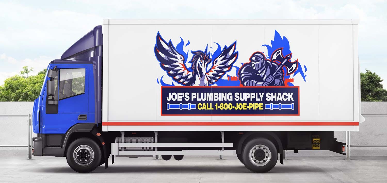
- “What if we added a pegasus fighting the guy with the sword in logo #5? But make his sword a battle axe.”

Feedback from the client can impose upon you more design constraints. Those limitations can force you down new creative paths and lead to some amazing ideas you may not have considered when the canvas was blank.
Don’t get me wrong, I am fully aware that crazy client feedback can lead to questionable outcomes like the plumber truck above. But that doesn’t mean it can’t help us push our creativityn and ultimately deliver creative ideas we never would have considered.
Exceeding Expectations
If you’ve followed my content for long, you’ve probably noticed that I frequently share strategies to help you charge more money for the work you do. And not just charge more money, but actually get the client to say “yes” to the increase. One of the most effective ways to increase prices successfully is to exceed the client’s expectations.
Consider this. You’ve been working hard to increase your prices. You finally got a client to say yes to a $5,000 logo project. You are thrilled. Using your newfound confidence, you decide THIS is the time to try the ONE logo option thing you saw on some random YouTube video. You do your prep work and design what you think is “the best logo option” for the client. You present the logo, proudly walking your client through your concept. After you finish presenting, the client says, “Is that the only option?” (They are “underwhelmed,” like we talked about earlier.) In their mind they are thinking, “$5,000 and we only get one choice? We’re not getting a lot for our money here.” The natural association with volume and price is hard to overcome.
On the flip side, what if you present four logo concepts instead of the three they expect? Or what if you told them about your amazing ONE logo approach, but then you create TWO logos? Or THREE? Or FIVE?
You say, “We know we had said that we were going to present one logo idea in our process, but we actually did three.”
Your client thinks, “Wow. That’s great! I can’t wait to see the options! We are getting more than we expected for our money. This is a good investment.”

Showing Options Controls Feedback
Showing your client multiple options can help control their feedback. When you deliver a few logo options, you can explore some safe designs, an aggressive idea and even something totally off the wall! When your client provides you with “what if” feedback, you will likely have something to look at together.
The client says, “What if we did something a little crazier with the logo?”
You can reply with, “We thought about that too. It led to us designing logo concept #4. Let’s look at that crazier option.”
When you present only one concept, the “what if” client feedback becomes an exercise in collective daydreaming without anything to look at together.
The client says, “What if we made something a little simpler?”
You reply, “Hmmm… ya… let’s close our eyes and try to envision what that might look like.”
An Effective Logo Design Process
As you may have guessed by now, I am a fan of multiple options versus one single choice. I built my career on exceeding expectations and attribute much of my success to creating “wow” moments with my clients.
“Wow! I love all these options.”
“Wow! I love the design presentation, very professional.”
“Wow! They turned this around faster than expected.”
You get the idea.
Here is the logo process we used to create great logos and “wow” moments with clients.
- Research: Discuss the objectives with the client. Research the audience, competitors and industry. Make sure you have a solid “creative brief” before work starts.
- Mood Boards: Find logo design ideas that match the creative brief. Create 3-5 mood boards of these logo ideas and discuss them with the client. Consider what will work best for the client and resonate with their target audience.
- Rough Logos: Create concept sketches or initial logo ideas. These designs are usually in black and white and can be pencil sketches or vector designs. We would usually commit to 3-5 concept sketches in our agreement, but frequently present 5-10 rough ides.
- Main Logo: After feedback on the rough logos, begin design work on the chosen direction. Here we add colors, explore typography, try different line weights etc. Usually we commit to 1-3 variations of the chosen direction, but present 3-5. The final main logo is refined through a few rounds of client feedback.
- Logo Family: After the chosen main logo is complete, the logo family is created. This typically includes variations like white on black, black on white, full color, two color, responsive sizes etc. The delivery of a logo family is typically a “here you go…this is your logo family” type of presentation.
Following this process the final files are delivered to the client and depending on the engagement a style guide and/or business stationery may be designed.
I’m not saying that the ONE logo approach can’t work. It just isn’t for me. And when I take my brain and hypothetically put it in my client’s head, I don’t think it is a good option for a lot of your clients either. But if you have success with it, then more power to you!


